
Sarah Marino's Photo Portfolio: Galleries By Location And Theme: Recent Photos And Trip Galleries By Year
Colorado Fall Color Photo Rejects
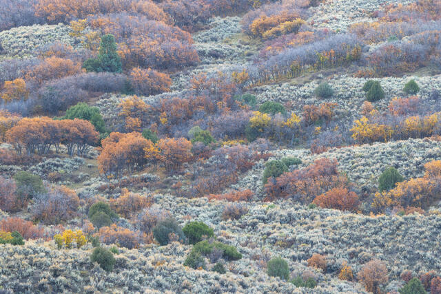
Autumn Intersections
Sage, Gambel oaks, and junipers in autumn. Southwestern Colorado.
REASON FOR REJECTION: I like this photo and will use it in the future. With the goal of tighter curation for this portfolio, I selected a different composition from the same general area (Sage and Oak) because it had a more dominant zig-zag line through the composition. Keeping both felt like duplication, not offering an additional interpretation on the same subject. Also, this mix of colors didn't work very well in the portfolio. The sage color, especially photographed at twilight, is a visual outlier compared to the rest of the portfolio and I found it easier to blend the other photo into a sequence that worked acceptably well.
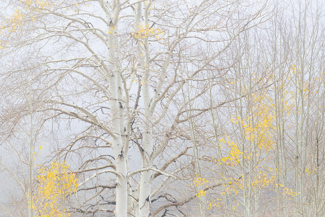
Older Aspens, Younger Aspens, Dallas Divide
Mostly bare aspen trees on a foggy autumn day near Dallas Divide in Colorado's San Juan Mountains.
REASON FOR REJECTION: I like this photo with the single older aspen as a focal point and the younger aspens surrounding it. I ended up selecting a scene with this same composition to include in the portfolio, just with a lot more fog (Aspens in Thick Fog) because it paired a bit better with another photo (Aspens in Fog, Dallas Divide). I previously would have included both but with the goal of tighter curation, I selected the photo that felt more cohesive. I'll still include this photo in my website archive and might use it for other purposes in the future, too. And now that I am writing up these comparisons, I might like this one better.
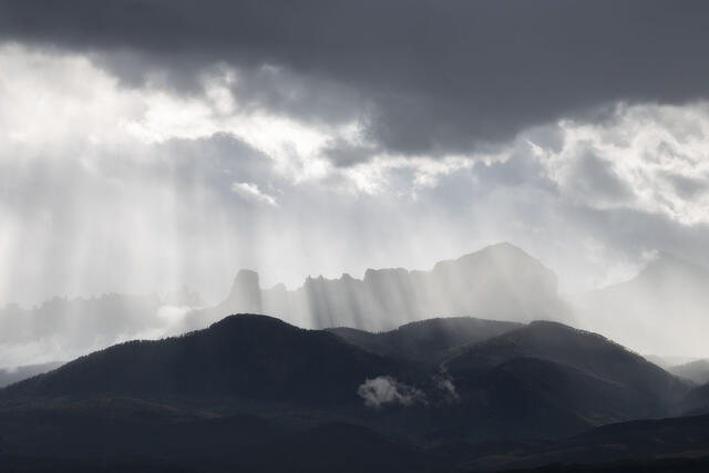
The Sky Opens Up
Sunbeams shine down over Courthouse Mountain and Chimney Peak, both of which are prominent peaks in the Cimarron Mountains of southwestern Colorado.
REASON FOR REJECTION: I am on the fence about this photo, likely because I had such a fun time taking it. We saw this light developing and slowy worked our way into a position where we could see the full expanse of mountains with the sunbeams shining down over them, and I'd consider it a superlative photo experience because the light was so incredible. I ended up selecting a tighter composition for the portfolio but still feel like this photo deserves more attention and possibly a fresh start with the processing. I might start with possibly cloning out the low cloud because I find it so distracting and I'd work on bringing a bit more depth and contrast back to the mountains since they look like a shadowy monolithic blob here. I usually wouldn't clone out something as big as the cloud but given this rare lighting situation, I'd like to make this photo work as part of my portfolio.
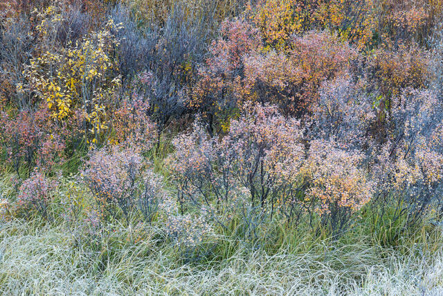
Frosty Birches and Grasses
Frost-covered dwarf birches and grasses in autumn. Southwestern Colorado.
REASON FOR REJECTION: Another photo I wanted to work! I have been trying to get a cohesive photo of a scene like this from this spot for years now, and failed again! Even with the frost and pretty colors, I do not think there is enough in terms of a focal point or structure for this composition. The shrubs feel messy without anything to settle on (except one dark shadowy area, which doesn't help). The frost and twilight light also leaves a cyan cast on the grasses, which I'd need to address if I decided to use this photo for anything. I'll continue trying because I love the idea, just not the execution!
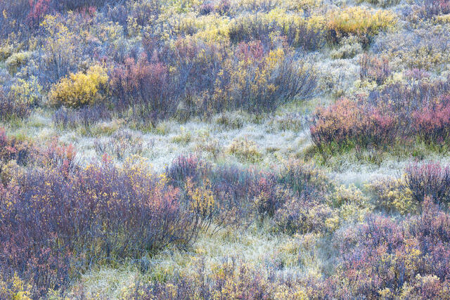
Birches and Grasses in Autumn
A subalpine meadow dotted with autumnal dwarf birches and grasses in southwestern Colorado.
REASON FOR REJECTION: I processed three similar photos with the idea that the three would together amplify each other. I ended up deciding they were too similar so I selected the single photo that I think has the strongest rhythm with the composition. This was my second favorite of the batch and I'd consider using it in the future (probably desaturating the yellows at the top since they pull a lot of attention from the rest of the scene).
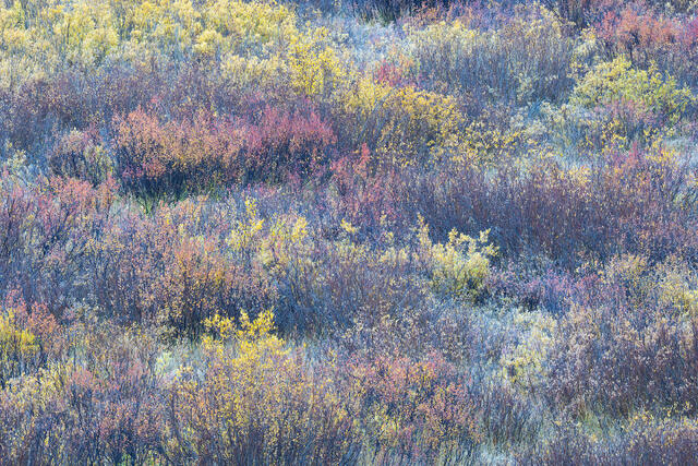
Stages of Autumn
A subalpine meadow dotted with autumnal dwarf birches and grasses in southwestern Colorado.
REASON FOR REJECTION: I processed three similar photos with the idea that the three would together amplify each other. I ended up deciding they were too similar so I selected the single photo that I think has the strongest rhythm with the composition. This is my least favorite of the three, mostly because of that heavy yellow patch at the top that interrupts the mixed color pattern across the rest of the scene.
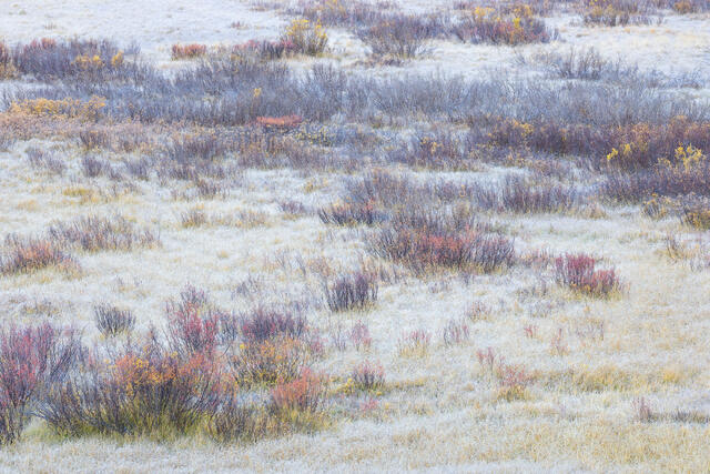
Birches and Frost-Covered Grasses
A subalpine meadow dotted with autumnal dwarf birches and frost-covered grasses in southwestern Colorado.
REASON FOR REJECTION: I like the idea of this photo but the frost covering the grasses along the upper edge pulls too much attention because it is so much brighter compared to the rest of the frame. I could have continued working on the color, contrast, and exposure but decided I had other similar photos that ended up working better. There also is not enough of a cohesive line or pattern to draw the eye through the frame. A bit earlier in the season might have worked better, too. I'm not sure that the mix of some color and a bunch of bare branches works in the first place.
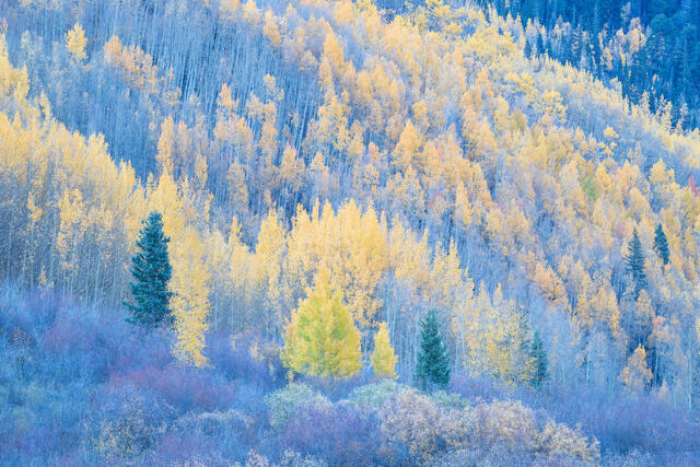
Forest in Transition
Willows and aspen leaves transitioning toward the end of autumn. Southwestern Colorado.
REASON FOR REJECTION: I like this photo but in trying to create a tighter portfolio, I decided that the yellow aspen tree in the lower middle blends in too much with the background trees while also sort of clashing in terms of color. I have considered revisiting the RAW file to see if matching the color of the greenish-yellow tree with the softer yellow trees behind it might make it blend in more, allowing the evergreens to step forward instead. As is, the greenish-yellow tree attracts a lot of attention while also being visually distracting because the greenish color clashes with the pastel color palette of the rest of the scene.
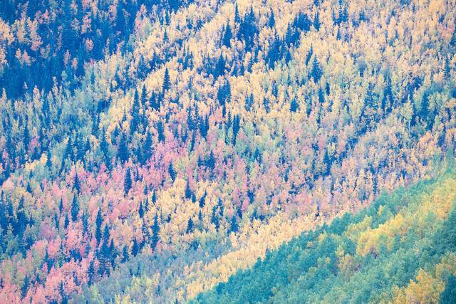
Aspens Forever
A colorful hillside of evergreens and autumnal aspen trees. Southwestern Colorado.
REASON FOR REJECTION: I love this hillside and photograph it every year when we are in Colorado to photograph fall colors. For this portfolio project, I ended up including two photos from this same spot (Intermixing and Spectrum), both of which are tighter crops. Two photos seemed like more than enough and I separated them within the portfolio to make the two photos seem less obviously duplicative.
I like this photo enough to include it in my full autumn archive but compared to the other two, the composition is a little too busy. There is also the visual contrast between the lower right triangle of aspens and the upper wave of evergreens plus aspens. The two regions feel a little disjointed (especially that VERY green tree in the lower right corner - definitely need to desaturate that if I decide to do anything with this photo). There is also a bit of a cyan cast (see: upper left) that I'd need to address.
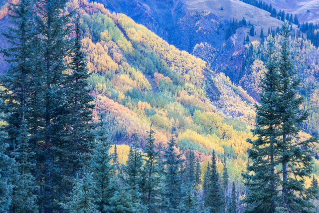
Overlook
A view through evergreen trees toward a colorful hillside of aspen trees. Southwestern Colorado.
REASON FOR REJECTION: I like the idea of the frame but the background being framed isn't interesting as a focal point. I have been trying some more complex compositions so the exercise was helpful but not successful. The background hillside is pretty but combining the two doesn't make much sense. (I think the hillside works better on its own, as a single idea.) This is another scene I liked a lot in the field but further reflection suggests that the concept doesn't work terribly well without a more visually dominant "main character" in the background.
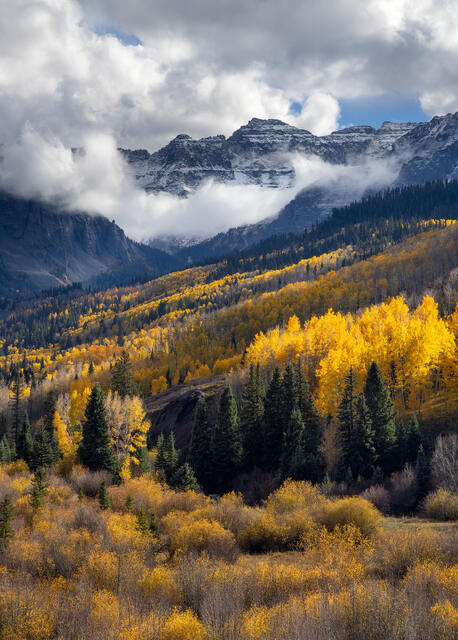
Clearing Storm, Sneffels Range
A storm clears over the Sneffels Range, above autumnal aspens and willows. San Juan Mountains of Colorado.
REASON FOR REJECTION: I like the composition concept with layers of willows receding to aspens and then onto the mountains. The deep shadows in the evergreen trees feel like a visual black hole and brightening those shadows looked awkward. I also do not like the square shape of the patch of blue sky above the mountains (which would have been easy enough to clone but I like the challenge of wanting everything to come together in the field, so I typically do not mess with clouds and skies). Had I been able to address the black hole shadows in a way that looked appealing, I probably would have included this photo. The strong side light works better with the aspens and willows but not the evergreens.
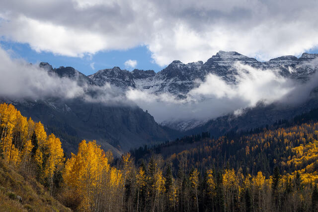
Autumn Aspens Below the Sneffels Range
A storm clears over the Sneffels Range, above autumnal aspens and willows. San Juan Mountains of Colorado.
REASON FOR REJECTION: The band of blue sky above the mountains is an ugly, blocky shape and it attracts too much unwanted attention. The little triangle of grasses in the lower left corner also feels disjointed. The treeline with the golden aspens is also strange, with it going downward and then straight across. While the weather conditions are nice, the composition doesn't have enough to make it work. This is an example of relying too much on the light and weather conditions to make something work.
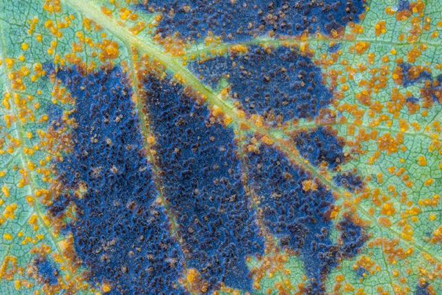
Compex Lifecycle
Aspen rust, a fungal disease, caused green leaves to drop in early autumn. Near Telluride, Colorado.
REASON FOR REJECTION: An interesting subject! The dark blocky shapes in the middle came to feel unbalanced and unappealing as I continued to view this photo. If the dark blocky shapes extended more equally across the frame, I think this would have worked better (or maybe not - I don't know if I like the mix of colors enough in the first place). I tried a few different compositions but there are only so many options when working with a subject the size of an aspen leaf!
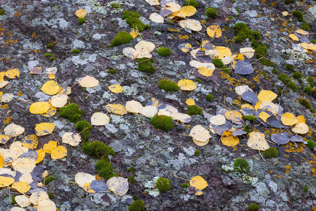
Leaves, Moss, Lichen, Rock
Moss, a variety of lichens, and aspen leaves on a large boulder. San Juan Mountains of Colorado.
REASON FOR REJECTION: I WANT to like this photo! I like all of its elements - the lichen, the rock, the dots of moss, and the aspen leaves. There isn't enough structure to pull the composition together. When I teach composition, I suggest sketching out the first lines and shapes of your scene to reveal its underlying structure. Once you see the structure, it is easier to decide if there is enough of a visual framework to make a composition work. Here, there isn't really anything cohesive to sketch in terms of structure--no discernible pattern and little visual rhythm. The individual elements are interesting but it is not much of a composition.
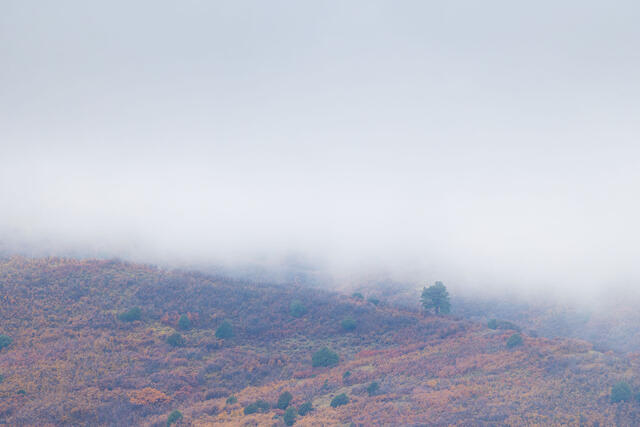
Lone Ponderosa on a Foggy Morning
A lone ponderosa tree is almost enveloped in a thick fog, with a colorful hillside of Gambel oaks below. Southwestern Colorado.
REASON FOR REJECTION: Too plain. I like (love!) minimalist compositions but this is just too simple. The fall colors are doing all the work and they are not enough. Maybe if the sky had a bit of texture and the tree had a bit more stature or a more distinctive shape.
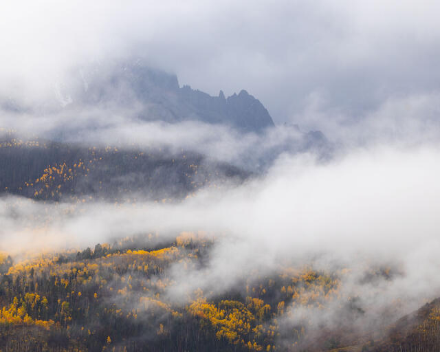
Glimpse
Low clouds hang over aspen-covered hillsides. San Juan Mountains in southwestern Colorado.
REASON FOR REJECTION: I like the mood of this photo, along with the shape of the fog. The little glimpses of mountains and aspens do not feel like enough to pull it all together. I processed a lot of photos from this outing because it was so much fun and felt productive at the time but the photos just haven't stood up with repeated viewing.
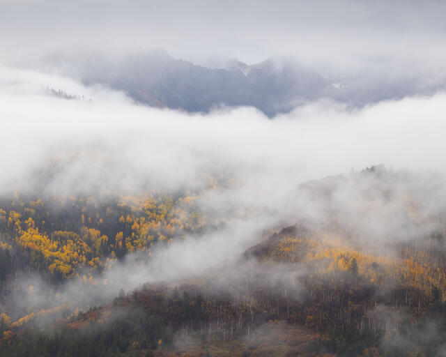
Low Clouds
Low clouds hang over aspen-covered hillsides. San Juan Mountains in southwestern Colorado.
REASON FOR REJECTION: I like the mood of this photo, along with the shape of the fog and hints of layering. The little glimpses of mountains and aspens do not feel like enough to pull it all together. I processed a lot of photos from this outing because it was so much fun and felt productive at the time but the photos just haven't stood up with repeated viewing. I'd consider this photo even less appealing compared to the last one in this rejects set.
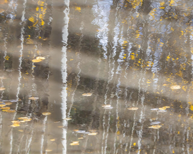
Aspen Leaves, Aspen Reflections
Aspen trees reflect on the surface of a small pond, with autumnal aspen leaves floating by. San Juan Mountains of Colorado.
REASON FOR REJECTION: I went back and forth about this one for a while and decided to leave it out because I didn't like the color palette and think the overall visual effect is confusing (it is possible this is a multiple exposure, which might help explain some of the visual confusion). The light gray streaks across the surface of the pond are an example of that visual confusion. The scene has too many literal visual points of reference, like the aspen leaves and trunks, to work as an abstract yet I don't think it works very well as a literal reflection scene because it has too much going on. Not awful, not great!
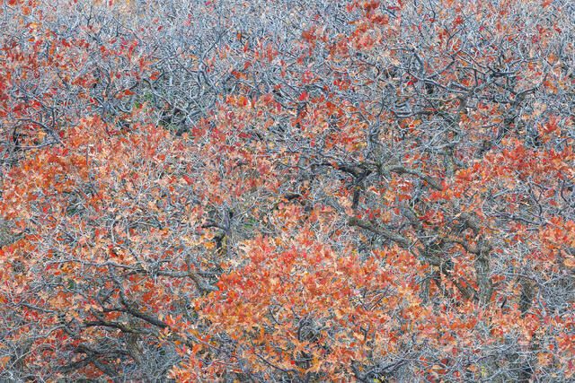
Fiery Autumn Orange
Fiery orange autumn leaves on a Gambel oak tree in southwestern Colorado.
REASON FOR REJECTION: Another photo I really wanted to work! There are not enough of the bigger limbs to pull this composition together. Instead, it just feels like patches of leaves and little limbs randomly scattered across the frame without any structure. A fine idea for a composition but I do not think this one works. There is also a round blob shape in the lower middle that attracts a lot of attention but is not very visually interesting.
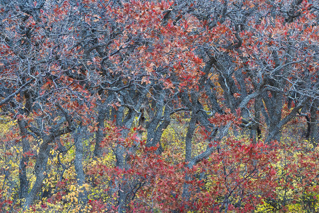
Red Gambel Oaks in Autumn
Gambel oaks, turned a rusty red at the end of autumn, in southwestern Colorado.
REASON FOR REJECTION: I wish the red oak leaves extended across the bottom! Or that the yellow leaves extended across the bottom! Or that the limbs extended across the bottom! As is, the patchy red and yellow across the bottom looks too disjointed to me. I like the top two-thirds of the frame and really dislike the bottom third because it lacks cohesiveness (some branches, some red, and some yellow but not enough of any of them to work well).
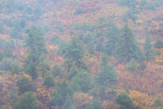
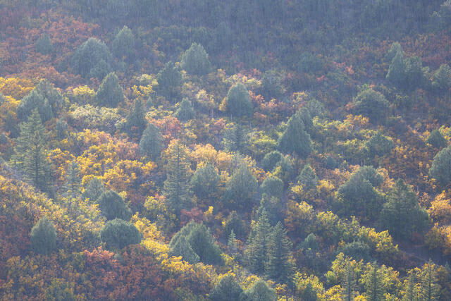
Soft Fog, Ponderosa Pines, and Gambel Oaks
A hillside thick with tall ponderosa pines and colorful Gambel oak on a foggy autumn day. Southwestern Colorado.
REASON FOR REJECTION: All the ponderosa and juniper trees blend together, looking like indistinct green blobs. I like the idea but there isn't enough fog or light to suggest layers or separation. This is another example of a scene that I really wanted to work because I love the combination of elements. A year ago, I'd likely have included this photo because of an emotional attachment to it but am now trying to be more objective in making the assessment that it does not work as well as I wanted it to work.
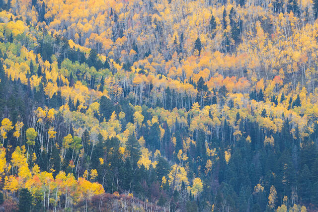
Aspens and Evergreens
A mix of autumn aspens and evergreen trees in southwestern Colorado.
REASON FOR REJECTION: The patch of evergreen trees in the lower right feels heavy, like a bit of a visual black hole. There are a lot of little visual distractions and inconsistencies along the bottom edge, as well. I like the implied rhythm of the intersecting diagonal lines of aspens throughout the frame but with so many versions of scenes like this in my catalog, this one doesn't offer enough to make it stand out. The lower left quadrant also introduces some visual inconsistencies that break the abstract pattern of the rest of the frame (the dominant oval evergreen tree all alone in the left corner and the little hills intruding into the frame).
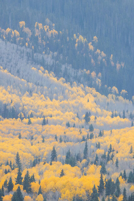
Expanse of Aspens
Autumnal aspens stretch up a mountainside. San Juan Mountains of Colorado.
REASON FOR REJECTION: This is another example of loving the flat, misty light while I was photographing and then deciding the photo feels too plain with repeated viewing. I like the idea of the aspens and evergreens reaching up this steep hillside but the light doesn't work well enough to put this into my portfolio. Maybe dehaze plus some contrast adjustments could help? I am still on the fence about this photo but objectively know that the light isn't very visually appealing.
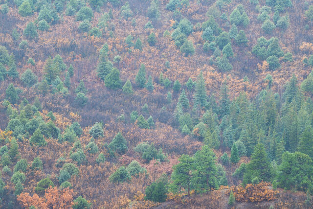
Slow Fog, Ponderosa Pines, Oaks, and Junipers
A hillside thick with tall ponderosa pines, junipers, and colorful Gambel oak on a foggy day in autumn. Southwestern Colorado.
REASON FOR REJECTION: This photo is on the bubble for me and I might reconsider using it for something in the future (because of an emotional attachment since I know it doesn't work that well in terms of the light and composition). At the time, I liked the soft, flat, misty light but the low contrast feels a little too plain now. I like the elements - junipers, ponderosas, and the autumn colors but.... The light feels too flat and the overall visual effect implies two clashing composition concepts in one frame. Is the scene about the repeating junipers against the autumnal colors (left side) or the hill with the ponderosa in the lower right? A little mist separating the hill with the ponderosa and the background could help but as is, there are a lot of reasons to conclude this does not work very well.
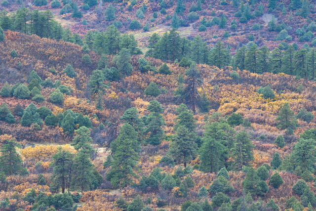
Ponderosa Pines and Gambel Oaks
A hillside thick with tall ponderosa pines and colorful Gambel oak in autumn. Southwestern Colorado.
REASON FOR REJECTION: I have an emotional attachment to this photo and wanted to include it because I like it. I don't think the composition holds up as the middle in particular feels a bit messy. I am still on the bubble about this one because I like the idea of the scene, although I know the composition has some issues (too much going on without enough structure to emphasize anything in particular, and without light to add emphasis that might help some part of the scene stand out).
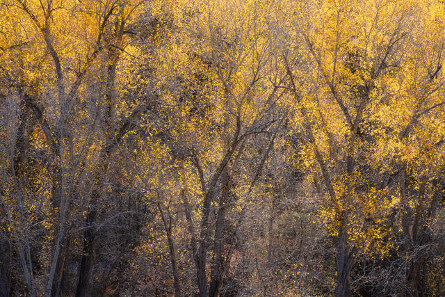
Backlit Cottonwoods, Ridgway, Colorado
A patch of vibrant backlit narrowleaf cottonwood trees along one of the county roads heading out of Ridgway, Colorado in autumn.
REASON FOR REJECTION: I like the idea here, with three dominant bunches of backlit cottonwood trees spread across the frame. The overall visual effect feels messy though and I do not like the darkness at the bottom of the frame. Lots of little visual black holes in the shadows that do not add to the visual appeal of the scene.
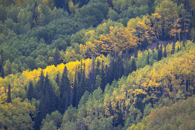
Aspens and Conifers, Southwestern Colorado
Colorful aspen and conifer trees mix together on a steep mountainside in southwestern Colorado.
REASON FOR REJECTION: I like the mix of diagonal layers, emphasized by the direct light hitting the middle of the scene. Once I saw the bare hillside in the right middle, it caught my attention every single time I looked at the photo since and I came to find it very visually unappealing (an example of visual weight - it is a small part of the scene but has a big negative impact once you notice it). The aspens in the lower right are starting to turn a muddy reddish color and that patch of color is distracting from the rest of the scene because it is inconsistent (and kind of unappealing).
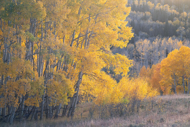
Meadow's Edge
Golden aspen trees at the edge of a meadow at sunset. Southwestern Colorado.
REASON FOR REJECTION: I was so excited about this photo when I took it! In terms of the light, this is a long exposure at twilight and getting the colors right proved challenging. The strong twilight glow looks fake but backing off of it also looks fake. I tried all sorts of color balance and selective color adjustments, only making things worse. I also do not like how the grove of taller trees in the middle merges with the shorter trees in the background. This lack of visual separation in the middle of the frame is visually confusing. A real disappointment!
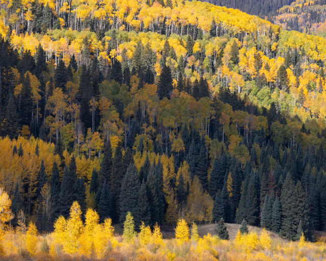
Midday Light
Autumn aspens, cottonwood trees, and evergreens in southwestern Colorado.
REASON FOR REJECTION: I do not know why I processed this photo in the first place. The upper third is just unappealing to me now. I like the line of bright aspens at the bottom but it feels cut off. With both the bottom and top not working, I should have rejected this the first time through my catalog. In the field, I should have repositioned myself and zoomed in a lot more (which I eventually did on a separate visit to this spot and included the result in the portfolio).
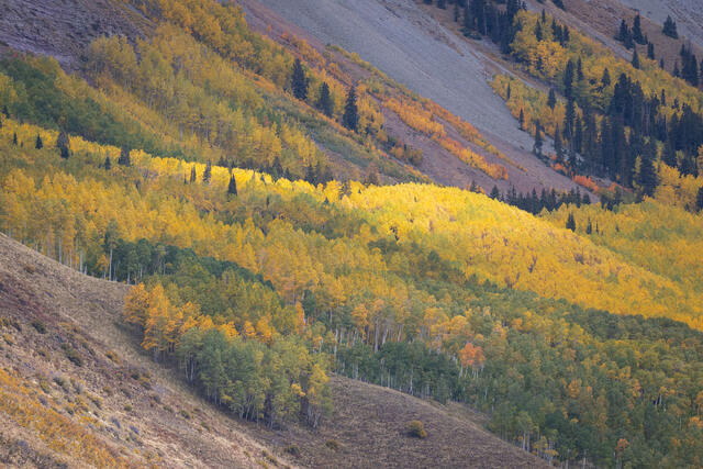
Dappled Light, Autumn Aspens
A spotlight of light shines through storm clouds, illuminating a section of yellow aspen trees. San Juan Mountains, Colorado.
REASON FOR REJECTION: The spotlight isn't enough to make the scene interesting. The gray scree fields in the background and the brown grasses in the foreground are not the most interesting framing and all the edges have some distractions going on. I kind of like this but in attempting a tighter curation, I decided to take it out (and likely would have left it in had I been creating this portfolio a year or two ago).
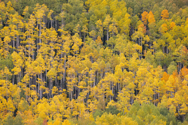
Matchstick Aspens
Very tall aspen trees grow on a steep hillside in southwestern Colorado.
REASON FOR REJECTION: This photo is on the bubble. I love the matchstick aspens and as aspen groves across southwestern Colorado decline, finding a scene like this where all the aspens are still alive is becoming more challenging. I decided to leave it out for two reasons. First, it feels repetitive compared to photos I have created in the past but not better or more interesting. Second, there is a reddish color cast on the bark of the aspen trees and I decided against spending the time to try to fix it since I was already feeling a little iffy about the composition. I'd consider starting over on the processing and including it in my Colorado fall colors archive because the basic idea is solid, just not terribly special.
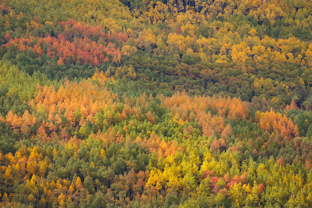
Early Autumn, Southwestern Colorado
An especially colorful hillside of aspen trees in early autumn in southwestern Colorado.
REASON FOR REJECTION: When I created this photo, I was drawn to the splotches of colors and the dappled light. In viewing it at a larger size than my LCD, I decided the mix of colors and light made it visually confusing. There is not much of a structure behind this composition, just patches of color. A crop off the top (and probably the right to keep the aspect ratio the same) could help since the top edge is the only part of the frame that has white aspen trunks against a dark background. I'd put this photo in the category of very lovely subject without much of a composition.
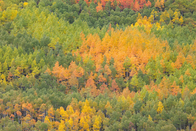
Color Mix, Aspen Trees
An especially colorful hillside of aspen trees in early autumn in southwestern Colorado.
REASON FOR REJECTION: If I were putting together a portfolio of fall color photos with the theme of warm yellows, oranges, and reds, I'd consider including this photo. Compared to the previous photo, this composition feels stronger to me, with the patch of yellow-orange aspens in the middle being visually dominant with a nice frame of green around the edges. The flat light is plain but I think it works for the scene. I do not love the warmer colors so I decided to leave this photo out to help with the goal of a tighter curation, although I do like it well enough to consider using it for something in the future.
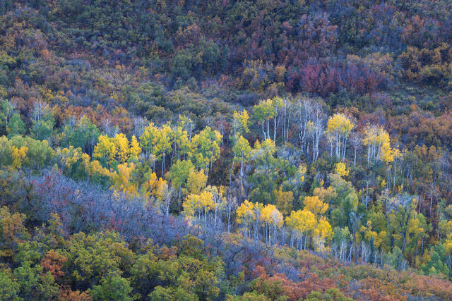
Aspens, Oaks, and Cottonwoods
Autumnal aspen trees, Gambel oaks, and cottonwood trees in the Cimarron Mountains in Colorado.
REASON FOR REJECTION: This hillside likely burned in the Gold Mountain Fire so I have some emotional attachment to the scene and wanted to include it for that reason. The composition doesn't feel like enough though. In the field, I liked the mound of aspens contrasting with the diagonal line of silver oaks. Now, it doesn't feel like these two ideas come together into a cohesive message. I also darkened the top to help the aspen mound stand out and think I went too far, as the darkness looks unnatural.
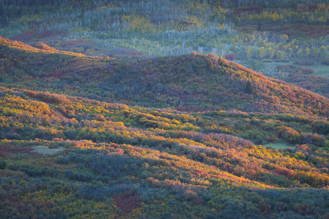
Last Light on Gambel Oaks
A colorful hillside of Gambel oaks in autumn, illuminated by the last light of the day. Cimarron Mountains, Colorado.
REASON FOR REJECTION: I'm still on the fence about this photo. I like the light and I like the general composition. I darkened the upper background too much but without the darkening, it all blends together a bit too much. In this case, the nice light isn't quite enough to overcome a lackluster composition. If the background was a hillside of oaks instead of aspens, it might feel more cohesive, too. This is another scene that I am feeling sad about since it likely burned in the Gold Mountain Fire, too. If I ever put together a portfolio of "what was" with that landscape, I'd consider including this photo but for this tighter portfolio, I don't think the composition is strong enough.
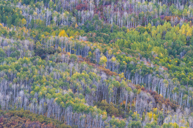
Past, Present, and Future
The bare aspens here have died, with their bare skeletons still standing, among a forest of living trees.
REASON FOR REJECTION: This hillside likely burned in the Gold Mountain Fire and I feel attached to the photo for that reason. This is another scene I like but the implied diagonal lines feel a little too subtle. With the patchy aspens and oaks, it doesn't feel like there is enough structure to pull it all together.
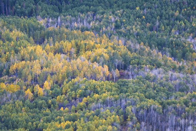
Fading Forest
The bare aspens here have died, with their bare skeletons still standing, among a forest of living trees.
REASON FOR REJECTION: I'm not sure why I processed this photo in the first place. The right third feels disconnected from the left two-thirds because the right is almost entirely green. There is not enough underlying structure or pattern to the composition to pull it together so it feels like a more random rather than intentional arrangement. Zooming in on more dynamic arrangements within the scene could have resulted in a more compelling composition or two.
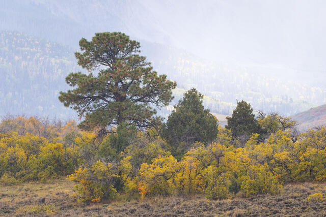
Ponderosa, Juniper, and Oaks
A ponderosa, junipers, Gambel oaks, and sage on a rainy autumn day in southwestern Colorado's San Juan Mountains.
REASON FOR REJECTION: I like this photo but do not think the shape of the ponderosa (the tallest tree) or the two rounded junipers makes for an interesting enough midground. The Gambel oaks (the yellow shrubs) are also kind of tattered and bare. It all feels a little messy. I do like how the shaft of rain separates the background and midground while hinting at the mountains. There just is not enough for this to pass the "Would I post this on Instagram?" test.
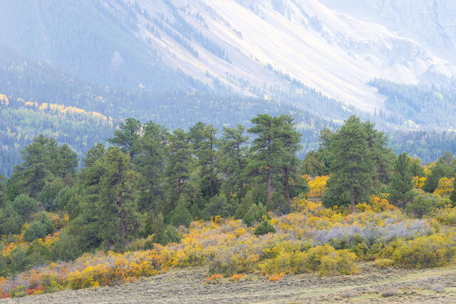
Ponderosas, Oaks, and Sage
Ponderosa and autumn Gambel oak trees below Mount Sneffels in Colorado's San Juan Mountains.
REASON FOR REJECTION: The ponderosa trees in the middle all look a bit too monolithic (like a sea of undifferentiated green). One ponderosa also almost touches the gray scree field in the background. The scree field just looks like a big blob of empty space, not adding much at all to the background except for a visual distraction. This is an example of a scene I loved in the field so I processed it but then realized that it has all sorts of flaws. If only I had the shaft of rain from the previous photo to separate the trees and obscure the background!
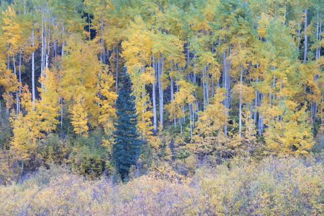
Transition Zone
A hillside of autumnal aspens, with colorful willows below, in southwestern Colorado.
REASON FOR REJECTION: I included three photos from this same general area in the portfolio (Aspen Hillside, Soft Evening Light, and Quiet Evening Among the Aspens) and although I like this photo, I think the evergreen tree merges with the background too much. If it stood out more, I'd consider it to be far stronger in terms of the composition. I like the soft colors and general idea behind the photo, just not the placement of the evergreen. I wish I had noticed that detail in the field as it would have been easy to address at the time.
Autumn Rain and Fall Colors
Sunlit rain falls over pines, Gambel oaks, and junipers in autumn. Southwestern Colorado.
REASON FOR REJECTION: This outing was so fun, with sun showers and dynamic weather all evening long. I like this photo and will include it in my autumn photo archive. I selected a different photo from the same spot because I liked the more even light and stronger streaks of rain. With this photo, the upper portion feels a little too empty but aside from that detail, I like the bands of direct light and the composition works well enough. In previous years, I would have included both photos in the portfolio so I found it hard to select just one. Does including just one of them make the portfolio stronger? I don't know!