Reviewing My Rejects: Moving Toward Tighter Curation
Written by Sarah Marino (all human, no AI)
As I mentioned in my last post about my Colorado Autumn: Close to Home portfolio, I started processing the photos late last year and since then, I have decided to move toward tighter curation of my work. This means that I processed more than forty photos that I did not include in the final portfolio. Below, I share a few of my reasons for heading in this direction along with a link to a hidden gallery where you can find these rejects, along with my reasons for deciding to exclude them.
When I started working on this post, I planned to summarize my reasons for a dozen or so photos. Along the way, I found the process of articulating and writing out my reasons to be quite helpful as a learning exercise for myself. I ended up writing a few sentences about every rejected photo. If you do not have the time or interest to read all of the entries, you can easily skim the gallery and review a smaller selection of photos that catch your eye, either for their positive attributes or their flaws, thinking about whether or not you agree with my assessments.
But first, an introduction to why I am doing this in the first place...
WHY TIGHTER CURATION?
A foremost part of my approach to nature photography has been breaking the landscape down into photos crafted around one or two core ideas and then pulling all these distilled ideas back together into a large portfolio, with a focus on telling a varied story about the connections I made as I experienced a place. I also sometimes like repeating motifs in a portfolio because slightly different takes on the same subject can amplify a visual message. The idea that photos are better together is a concept I return to often, as well. An example in this portfolio is scenes of aspen leaves on the ground and floating in water, with slight variations on the angle and approach to composition. Some viewers might see this as repetitive or unnecessarily duplicative, which could be a fair critique. I, however, typically see this kind of repetition as emphasizing a visual motif that I found especially appealing, with multiple views adding something to the story or offering a quiet interlude for the viewer.
However, reality is clashing with this approach, as I cannot possibly ever get through all my photos if I continue working with very large portfolios. To illustrate, I’ll share two examples from trips where we were working from a camper on weekdays, photographing around sunrise and/or sunset and on weekends. First, we spent about a month in the Upper Midwest in October, 2024. I have 380 photos that I have tagged as candidates for processing. Second, we spent about a month in New Zealand last October and experienced generally awful weather for most of the trip, thus reducing our photographic opportunities. Even with poorer conditions, I still have more than 250 photos I’d consider processing from that trip. And these numbers are from just two trips...! Even if I spent all my time processing photos, I could never get through this backlog I have created for myself.
I have finally come to terms with the fact that I would prefer to have some favorites processed from every trip rather than be “finished.” I am generally a completionist so my tendency is to want to be able to mark a folder of files as DONE so that I can feel as if the project is fully wrapped up. This is no longer a realistic approach as I accumulate more and more unfinished files with the field style I describe above.
MORE INTENTION OVER VIBES?
Additionally, as I evolve as a photographer, holding myself to a higher standard and curating tighter, more cohesive bodies of work is becoming more important to me so I am finding that I need to be more deliberate in assessing my work, rather than just flowing with the "I like it so I'll include it" vibe. Since my photography is entirely based on what I connect with when I am outside and I elevate resonance as the most important part of the photographic process, nearly all of the photos I create in the field are what I would describe as true to my vision or authentic to me. Thus, I feel some emotional connection to all of them because connection is where each and every photo started. I am realizing that this connection is no longer enough of a filter when curating a body of work if I want my work to rise to a higher standard.
In preparing this post and my annotations for all the rejects, I found it incredibly helpful to have to articulate my reasons for deciding to include or not include individual photos in the portfolio. And, I think I will informally continue this practice because I still included a few photos in which a more objective assessment would result in a rejection. Overall, though, I feel like I did a better job of eliminating photos I like but that do not represent my best or most interesting work right now. Progress, not perfection.
A LIST OF CONSIDERATIONS
What makes a good or interesting photo is extremely subjective and trying to create a list of objective criteria is impossible because we all have different ideas of what makes a “good composition” or “good light” or an “interesting” scene. As an example, Art World Experts often look down on nature photography as trite. Over the last week, in contrast, I have seen photos of a toilet and a wall socket, both in plain light, elevated as examples of artistic excellence, yet a photo of intricately patterned and colorful aspen leaves, falling in a visually dynamic pattern, would likely be considered by the same "expert" to be cliché or boring. It makes no sense to me how a documentary photo of a wall socket can be art but natural subjects are somehow not.
I include this digression to emphasize just how subjective all this is and emphasize why it is important for each of us as individuals to understand why we photograph and then compare our photos to those personal reasons and motivations as we assess them. Instead of looking outward or toward experts to help us make such decisions, I'd suggest that developing a flexible set of personal priorities to test each photo against can help add greater intentionality and consistency to a very nebulous process while still allowing some room for whimsy, vibes, and surprises.
I tried, imperfectly, to write out a list of the ideas I considered as I went through this exercise.
- TECHNICAL QUALITY: Technical quality is a given. Because I care a lot about the craft of photography, I need to have a very good reason for including a photo with an obvious technical flaw. (I’ll note here that there is nothing such as the “correct” depth of field, as I am sure some more rule-oriented photographers will see some of my depth of field choices as technical flaws. By passing a check for technical quality, I mean that the photo is executed as I intended it in terms of sharpness, focus, and exposure, and sometimes these decisions could be considered “incorrect” or “flaws” by others, especially when only one teeny, tiny thing is barely in focus.)
- VISUAL APPEAL: Why is the subject interesting and visually appealing to me? How does it visually fit in with the larger set of selections?
- LIGHT: How is the light flattering for the scene? (I like flat light so what I like here will likely diverge from what many other photographers consider “good” light, which is an example of how this is a personal exercise, not one meant to conform to some objective standard.)
- COMPOSITION: What are the key elements of the composition and do all those elements work well together? If there are flaws with the composition, does the subject or light make up for the flaws? Are there any distractions that make it less visually cohesive? How would I describe the visual message of the composition in a few words?
- COLORS: Do the colors in the scene work together? Do the colors work with the larger portfolio? Do the colors align with my general personal preferences for colors?
- CONCEPT FIT: How does the photo fit into the concept of the portfolio overall? If it is an outlier, can I articulate a good reason for including it?
- DUPLICATION: If a photo feels duplicative or redundant to another photo I am considering for inclusion, what is my reason for wanting to include both or a set? Does the repetition amplify the visual message or dilute it?
- INSTAGRAM TEST: Would I post it as a stand-alone photo on Instagram (not because I think it might get a lot of likes but because I am proud enough of it to reach that level of sharing)? If not, does it amplify other photos in the collection or tell a story that was an especially important part of the experience of the place?
- EXCELLENCE: Not every photo has to represent “my best work” but does the photo generally rise to what I would consider a level of excellence given my current body of work (not comparing to others but comparing to my previous work, my future goals, and my evolving standards for myself)?
- ADDING TO THE CONVERSATION: For familiar places (familiar to me, not necessarily to others), is the photo repetitive of what I have done before or does it add something new to my body of work? Does it add something to the conversation or visual record of the specific place? If not, what is my reason for wanting to include the photo?
- LOVE AND AFFECTION: Why do I love or like the photo? Is my affection too strongly tied to a memory, moment, or experience rather than grounded in what I want to say about the place?
ACCOUNTABILITY TO HIGHER STANDARDS
Learning to articulate and write out my thinking about photography is something I have always found to be helpful and clarifying, and now I can add writing about my rejects as another beneficial extension of that process. It wasn't exactly pleasant writing these up these annotations but I think this process is helping me be more honest with myself about the flaws in my work, and confronting those flaws will help me improve over time. I don’t foresee going through this list for every single photo but will continue this process in some way, hoping that doing so will help make it more intuitive and add some accountability.
And, for fun (fun?), I am showing all of this work in public! I have included a few examples below. You can see the full set of rejects in this gallery, with my reasons for not including each photo summarized in the caption. If you think I have made any egregious omissions, I’d welcome your input but I expect you will find agreement with many of my explanations. And, if you find reading my explanations about my photos to be helpful, I'd encourage you to do the same with a few of your photos, too.
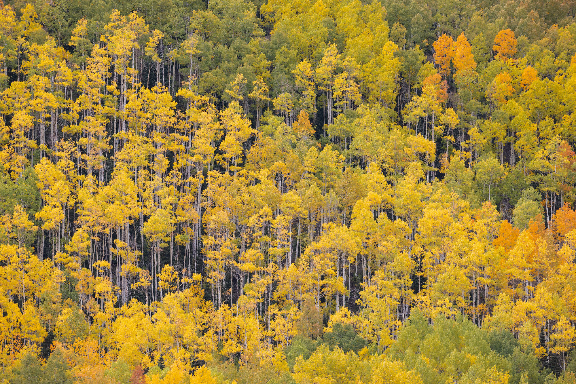
Very tall aspen trees grow on a steep hillside in southwestern Colorado.
REASON FOR REJECTION: This photo is on the bubble. I love the matchstick aspens and as aspen groves across southwestern Colorado decline, finding a scene like this where all the aspens are still alive is becoming more challenging. I decided to leave it out for two reasons. First, it feels repetitive compared to photos I have created in the past but not better or more interesting. Second, there is a reddish color cast on the bark of the aspen trees and I decided against spending the time to try to fix it since I was already feeling a little iffy about the composition. I'd consider starting over on the processing and including it in my Colorado fall colors archive because the basic idea is solid, just not terribly special.
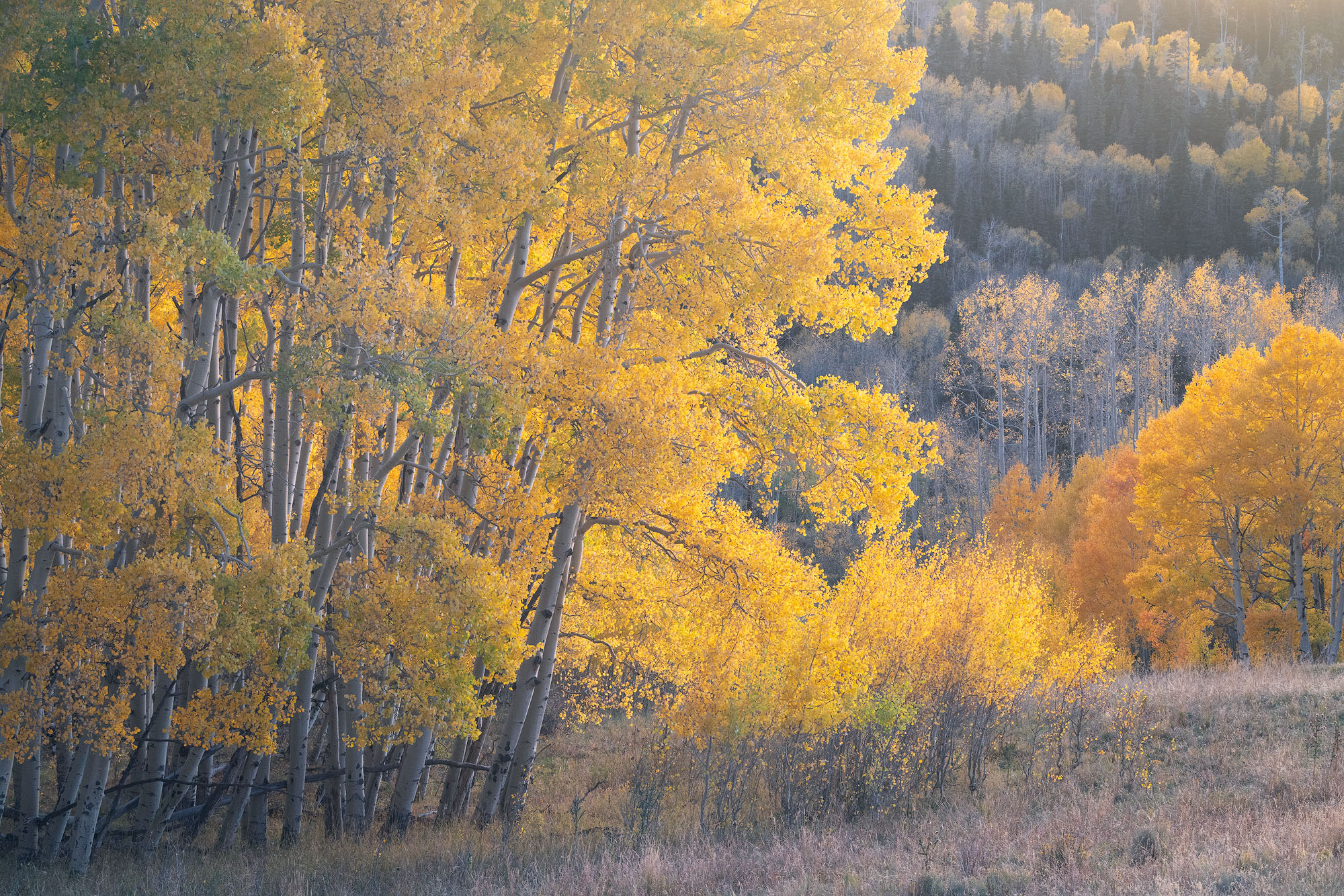
Golden aspen trees at the edge of a meadow at sunset. Southwestern Colorado.
REASON FOR REJECTION: I was so excited about this photo when I took it! In terms of the light, this is a long exposure at twilight and getting the colors right proved challenging. The strong twilight glow looks fake but backing off of it also looks fake. I tried all sorts of color balance and selective color adjustments, only making things worse. I also do not like how the grove of taller trees in the middle merges with the shorter trees in the background. This lack of visual separation in the middle of the frame is visually confusing. A real disappointment!
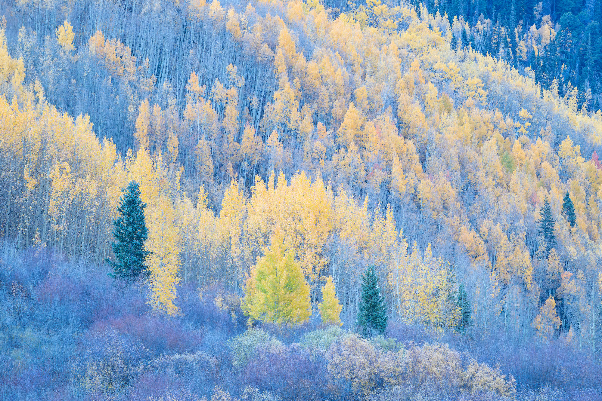
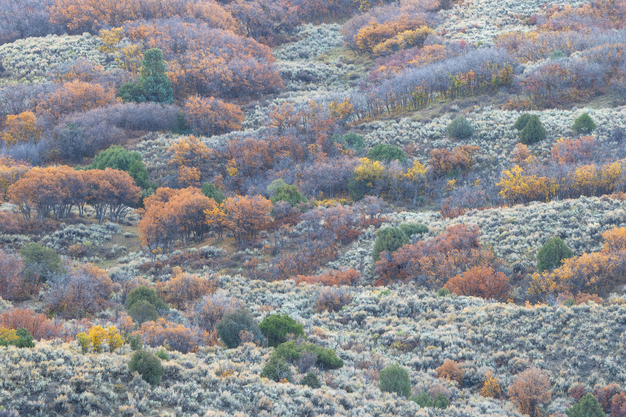
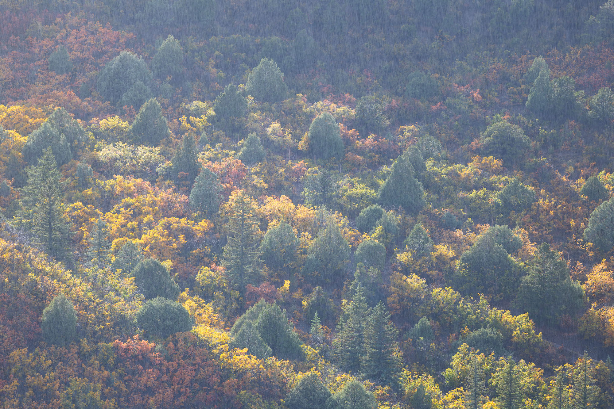
Willows and aspen leaves transitioning toward the end of autumn. Southwestern Colorado.
REASON FOR REJECTION: I like this photo but in trying to create a tighter portfolio, I decided that the yellow aspen tree in the lower middle blends in too much with the background trees while also sort of clashing in terms of color. I have considered revisiting the RAW file to see if matching the color of the greenish-yellow tree with the softer yellow trees behind it might make it blend in more, allowing the evergreens to step forward instead. As is, the greenish-yellow tree attracts a lot of attention while also being visually distracting because the greenish color clashes with the pastel color palette of the rest of the scene.
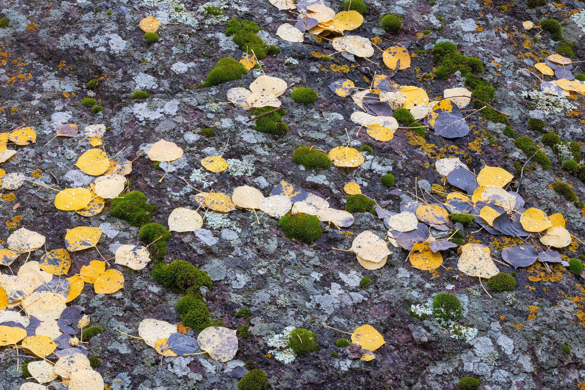
Moss, a variety of lichens, and aspen leaves on a large boulder. San Juan Mountains of Colorado.
REASON FOR REJECTION: I WANT to like this photo! I like all of its elements - the lichen, the rock, the dots of moss, and the aspen leaves. There isn't enough structure to pull the composition together. When I teach composition, I suggest sketching out the first lines and shapes of your scene to reveal its underlying structure. Once you see the structure, it is easier to decide if there is enough of a visual framework to make a composition work. Here, there isn't really anything cohesive to sketch in terms of structure--no discernible pattern and little visual rhythm. The individual elements are interesting but it is not much of a composition.
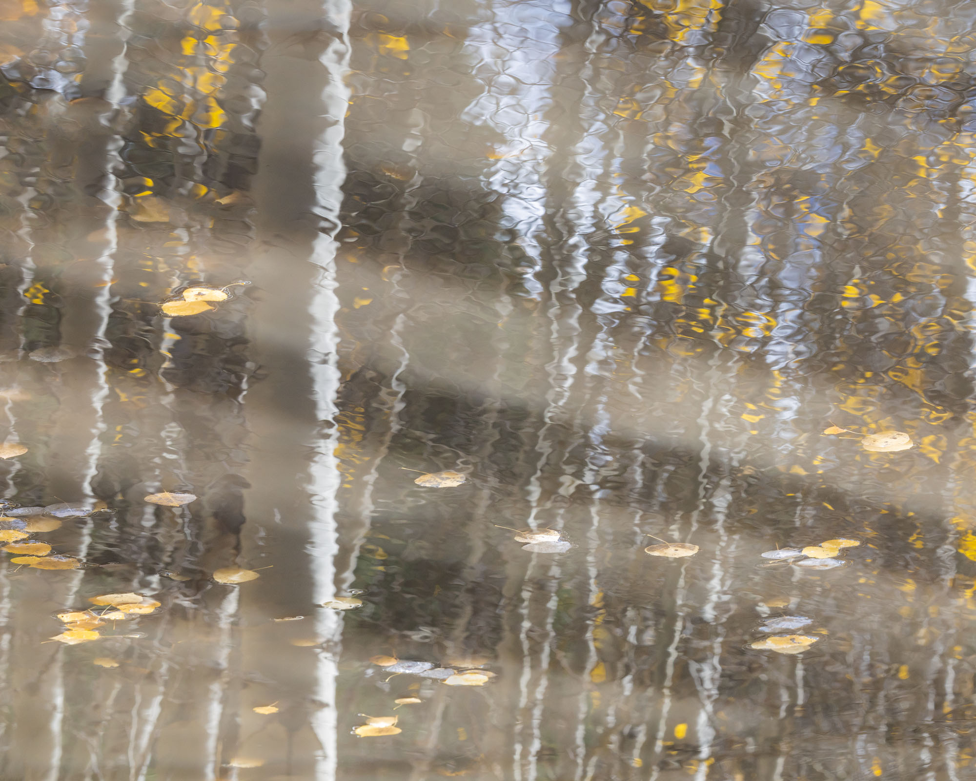
Aspen trees reflect on the surface of a small pond, with autumnal aspen leaves floating by. San Juan Mountains of Colorado.
REASON FOR REJECTION: I went back and forth about this one for a while and decided to leave it out because I didn't like the color palette and think the overall visual effect is confusing (it is possible this is a multiple exposure, which might help explain some of the visual confusion). The light gray streaks across the surface of the pond are an example of that visual confusion. The scene has too many literal visual points of reference, like the aspen leaves and trunks, to work as an abstract yet I don't think it works very well as a literal reflection scene because it has too much going on. Not awful, not great!